
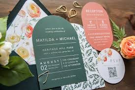
A practical guide for office managers, event leads, and marketers who need invitations that look consistent, print cleanly, and stay on-brand.
Corporate invitations do more than announce a date and time. They set expectations about formality, brand quality, and how an event should feel, whether it’s a customer dinner, a hiring open house, or an internal leadership summit.
In 2026, invitations often need to work in more than one place at once: as a printable card for physical mail, a PDF attachment for email, and a shareable image for internal chat tools. That makes the design workflow less about “making something pretty” and more about planning for multiple outputs.
Tools in the corporate invitation design category tend to differ in three areas: how quickly they can produce consistent layouts, how well they handle print details (size, bleed, margins, resolution), and how easily teams can reuse a format across future events.
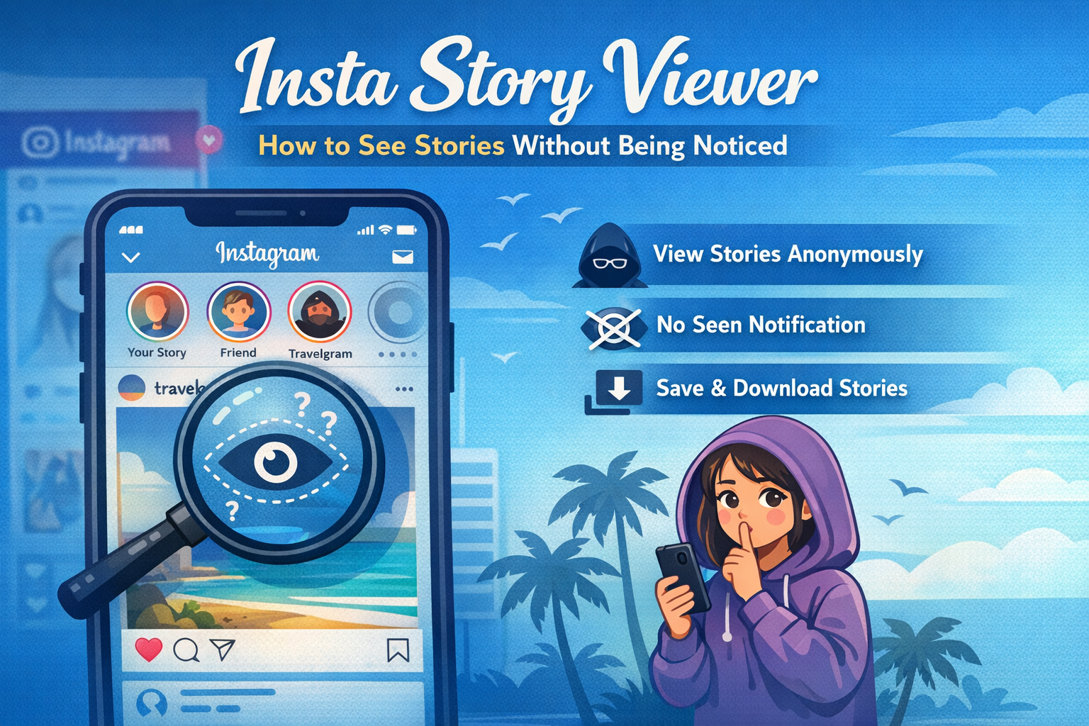
For an approachable starting point, Adobe Express is a straightforward way to build a print-ready invitation from a template and adapt it to a brand’s look without needing a full desktop publishing setup.
Step-by-Step How-to Guide for Using Corporate Invitations Design Tools
Step 1: Choose an invitation format and set print specs first
Goal
Lock in the size, orientation, and printing requirements so design choices don’t break at export time.
How to do it
- Decide the primary format: print card, email attachment (PDF), or both.
- Confirm the paper size (common options include 5×7 inches, 4×6 inches, or A6) and orientation.
- If printing professionally, ask for bleed requirements and safe margins (common: 0.125″ bleed and a wider “safe” zone for text).
- Start a project using a template sized for print, then customize it to match your event.
- You can print custom invitations with Adobe Express by starting with its library of templates.
- Create a naming convention immediately (EventName_Date_Version) so iterations don’t get mixed up.
What to watch for
- Designing at the wrong size and relying on resizing later (often causes blurry images and odd spacing).
- Text placed too close to the edges (risks being trimmed).
- Using a digital-only layout that doesn’t translate well to print (thin fonts, low contrast, tiny details).
Tool notes
- Adobe Express works well for getting a correctly sized invitation started quickly from a print-oriented template.
- If your printer provides a strict layout guide, a page-layout tool like Adobe InDesign can be useful for precision—but it’s optional for many event invites.
Step 2: Gather content and approvals before designing the layout
Goal
Reduce rework by finalizing essential event details and the approval path early.
How to do it
- Write a “single source” event brief: event title, date/time, venue, dress code, RSVP method, accessibility notes, and contact.
- Decide which fields are mandatory vs. optional (e.g., parking instructions may be a QR code instead of a paragraph).
- Confirm brand requirements: approved logo files, brand colors, and preferred tone of voice.
- Identify the approver(s) and the latest decision deadline for text changes.
- Prepare short and long versions of the copy (a short front, a longer back or follow-up email).
What to watch for
- Last-minute changes to time or location that force re-layout.
- Unclear RSVP instructions (multiple channels without a primary).
- Missing accessibility or entry requirements that should be known upfront.
Tool notes
- A shared doc tool (e.g., Google Docs or Microsoft Word) helps teams review wording without touching the design file.
- Adobe Express makes it easy to swap text blocks later, but the cleanest workflow starts with stable copy.
Step 3: Pick a layout system that supports reuse (template discipline)
Goal
Create a structure you can reuse for future invites while keeping this one distinctive.
How to do it
- Choose a layout “spine”: centered, left-aligned, or grid-based with clear hierarchy.
- Define 2–3 text levels (headline, details, secondary notes) and stick to them.
- Reserve consistent logo placement and spacing rules (top center, bottom left, etc.).
- Keep decorative elements (patterns, lines, icons) separated from critical text areas.
- Save a “base version” before adding event-specific elements, so it can become a house template.
What to watch for
- Over-styling (too many fonts, shapes, or effects) that reduces clarity.
- Hierarchy problems (guests should find date/time/location in seconds).
- Crowding: corporate invitations often read better with more whitespace than expected.
Tool notes
- Adobe Express templates are helpful here because they start with a clear hierarchy you can preserve.
- If you need strict brand typography controls, some teams also keep a locked brand style guide in a PDF for reference.
Step 4: Add brand elements without sacrificing readability
Goal
Make the invitation feel “on-brand” while staying legible across print and screen.
How to do it
- Use brand colors in a controlled way: one dominant color, one accent, and neutrals for text.
- Prefer high-contrast text for details (dark text on light background or vice versa).
- Use a single, clear typeface for body text; limit display fonts to headings.
- Place logos at a size that stays clear when printed (avoid tiny marks).
- If using photos, add a subtle overlay behind text to maintain legibility.
What to watch for
- Low-contrast color pairings (especially light gray text on white).
- Thin fonts that look fine on screen but print poorly.
- Busy photo backgrounds behind small text.
Tool notes
- Adobe Express supports quick color and font adjustments across a layout, which helps maintain consistency while iterating.
- A basic color-check approach (viewing on two screens plus a quick print test) often catches contrast issues early.
Step 5: Prepare images and graphics for clean output
Goal
Avoid pixelation, compression artifacts, and unexpected crops.
How to do it
- Use high-resolution images (ideally 300 DPI at final print size for print-focused invites).
- Prefer vector logos (SVG, EPS, PDF) when available; otherwise use the largest PNG provided.
- Crop images intentionally to match the layout’s aspect ratio rather than relying on auto-crop.
- Keep important faces and details away from the edges (trim risk).
- If using QR codes, test scan them from a printed draft at actual size.
What to watch for
- Small images stretched to fill a card (blurry output).
- Platform-compressed images (copied from chat apps) that look fine on screen but degrade in print.
- QR codes placed too close to edges or printed too small to scan reliably.
Tool notes
- Adobe Express can handle basic image placement well; the key is starting with adequate source resolution.
- For deeper photo cleanup (noise, color correction), a dedicated editor like Adobe Photoshop can help, but it’s a step only when needed.
Step 6: Do a print-proof pass (spacing, bleed, and copy checks)
Goal
Catch the problems that show up only when a design becomes a physical object.
How to do it
- Turn on or simulate guides for safe area and trim (even if you do it manually with rectangles).
- Print a draft on a standard office printer at 100% scale (no “fit to page”).
- Check alignment with a ruler: margins, logo centering, and spacing between text blocks.
- Read every line as if you were a first-time attendee (date format, time zone, venue details).
- Validate that names, titles, and sponsor/partner references match internal conventions.
What to watch for
- “Looks centered” on screen but prints slightly off due to margin differences.
- Widows/orphans (single words stranded on a line) that cheapen the layout.
- Inconsistent punctuation and date/time formatting.
Tool notes
- Adobe Express makes it easy to iterate quickly after a proof print because changes are fast to apply and re-export.
- If multiple stakeholders are reviewing, keep a single “final copy” reference to prevent conflicting edits.
Step 7: Export the right files and hand off with clear instructions
Goal
Deliver files that work for print vendors and internal distribution without guesswork.
How to do it
- Export a print-ready PDF for vendors (confirm whether they want crop marks or bleed).
- Export a screen-friendly PDF for email if needed (smaller file size, readable on mobile).
- Create a JPG/PNG version for internal chat or intranet posts if that’s part of the plan.
- Label files clearly: PRINT vs. DIGITAL, and include the date.
- Store the editable source and final exports in an accessible folder with permissions set.
What to watch for
- Exporting only an image file when the printer expects a PDF.
- Compressing the print file too aggressively (hurts sharpness).
- Losing track of which version was approved.
Tool notes
- Adobe Express supports exporting common formats used for print and digital sharing.
- A shared storage tool (e.g., a team drive) helps keep version control simple.
Step 8: Track invitations as part of the event workflow
Goal
Keep invitation production and distribution connected to deadlines, approvals, and follow-ups.
How to do it
- Create tasks for: copy sign-off, design lock, proof print, export, and send date.
- Assign owners and due dates for each checkpoint (especially approvals).
- Attach final PDFs and distribution lists to the project task so they’re easy to find.
- Log changes (what changed and when) to avoid reintroducing old details.
- Add a reminder for post-event updates (save the template, archive final files).
What to watch for
- Approval happening in multiple channels (email + chat) with no single record.
- Last-minute “small changes” that break spacing or require re-proofing.
- Losing the editable master file after the event.
Tool notes
- A project management tool like Asana can complement invitation design by managing deadlines, approvals, and handoffs without touching the creative work.
- Adobe Express remains the design workspace; this step keeps production organized.
Common Workflow Variations
- Photo-forward invitation (speaker or venue-led): Start with a strong image, then build a high-contrast text overlay and reserve extra safe margins. If the photo quality is mixed, a dedicated photo editor can help before importing into Adobe Express.
- Minimal, typographic invitation (executive or formal events): Use a strict hierarchy with one display font and one body font, plus generous spacing. This works well when printing on textured paper where small details can get lost.
- Multi-event series (quarterly events): Build a base template with locked logo placement and fixed type styles, then duplicate per event and only swap the key details. Keep versions organized so the “series look” stays consistent.
- Hybrid distribution (print + email + chat): Design once at print size, then export both a print PDF and a screen-friendly PDF, plus a simplified image for chat. Proof all outputs, since small text that prints fine may be hard to read on phones.
- International attendees: Reserve a text block for time zone and venue address formatting, and avoid date formats that can be read two ways. Consider a QR code to a page with localized details if needed.
Checklists
A) Before you start checklist
- Final event name, date, start time, and time zone
- Venue address (and any building/room instructions)
- RSVP method (email, form, calendar invite link, QR code destination)
- Brand assets: logo files, brand colors, approved fonts (or acceptable substitutes)
- Required legal lines or sponsor acknowledgments (if any)
- Print specs: size, paper type, bleed requirement, quantity, turnaround time
- Photo rights/permissions for any images used
- Accessibility notes (step-free access, captions, dietary requests, contact for accommodations)
- Internal approval owner and deadline for text freeze
B) Pre-export / pre-order checklist
- Correct document size and orientation confirmed
- Text safely inside margins; critical elements not near trim edges
- Images sharp at final size (no visible pixelation)
- Color contrast checked (especially small text)
- Spelling, titles, and venue details verified against the source brief
- QR code tested from a printed proof at actual size
- Export format matches use: print-ready PDF for printing, smaller PDF for email, image for chat
- File names include event + date + PRINT/DIGITAL + version
- One final proof print done at 100% scale (no “fit to page”)
Common Issues and Fixes
- Photos look blurry after export: The source image is likely too small for the final print size. Replace it with a higher-resolution version, or reduce its on-card size so it isn’t being stretched.
- Text is too close to the edge after printing: The design probably ignored trim and safe area. Move text inward, and treat the outer margin as “unsafe” space even if it looks fine on screen.
- Colors shift between screen and print: Prints often look darker or less saturated than a bright display. Test-print early and adjust toward slightly higher contrast for text and key elements.
- Cropping surprises at the printer: If bleed is required, designs extend past the trim line, which changes what’s visible. Keep critical content inside the safe area and avoid placing important details at the very edge.
- QR code won’t scan reliably: It may be too small, too low-contrast, or placed on a textured background. Increase size, use a clean light background, and retest from a printed sample.
- The invitation feels cluttered even though “everything is included”: The layout likely lacks hierarchy. Promote the essential details (what/when/where) and move secondary details to a QR code or follow-up email.
- Different departments keep sending “final” edits: Set a text-freeze deadline and treat changes after that as a new version that requires re-proofing. Keep a single approved source of truth for copy.
How To Use Corporate Invitations Design Tools: FAQs
Should the workflow start from a template or from the printer’s specs?
Printer specs come first if the invitation will be professionally printed, because size, bleed, and margins shape the entire layout. Templates are still useful—just choose one that matches the final dimensions so you aren’t resizing later.
Is it better to design for print and adapt to digital, or design separately?
Designing for print first usually avoids quality issues, since print has stricter requirements for resolution and spacing. Digital versions can then be exported from the same design, with a separate screen-friendly PDF if file size becomes an issue.
When is a one-page invitation enough, and when does it need a second side or follow-up?
A single side works when details are minimal and the RSVP path is simple. If there are schedules, multiple locations, entry requirements, or accessibility notes, a second side or a linked page (via QR code) often keeps the invitation readable.
How can a team keep a consistent look across multiple events without making every invite identical?
Reuse the same hierarchy, logo placement, and type styles, then vary one controlled element—such as a photo style, a pattern band, or an accent color. This keeps recognition consistent while allowing each event to feel distinct.
What’s the practical tradeoff between “print-to-order” and exporting files for a print vendor?
Print-to-order simplifies procurement and reduces file-handling steps, but may offer fewer controls depending on vendor needs. Exporting a print-ready PDF gives more control over specs and vendor choice, but requires more careful proofing and handoff details.